Week 1 Log
Week 1: Prototyping
First week of prototyping: A challenge for the programmers as they’ve never used blueprints before. They had to follow some tutorials, which allowed them to learn a lot. They first tried implementing movements, which was harder than expecting since working in unreal was so new to them. The movements were calculated but were not applied. After trials and errors, they learned about using the Event Tick which eventually solved that first problem. After that, they tried to make the multiplayer game-play work. They first failed several time but eventually found out they just had to assign the characters to each player’s controller. It works now just fine. Lastly, they were able to add a camera which would follow the players and zoom in or zoom out depending how spread out the players are. The camera angle is still not exactly what we want but we’ll work further on that next week. They also tried whether a split screen or one single screen would be better. Turned out one screen would probably be better for our kind of game.

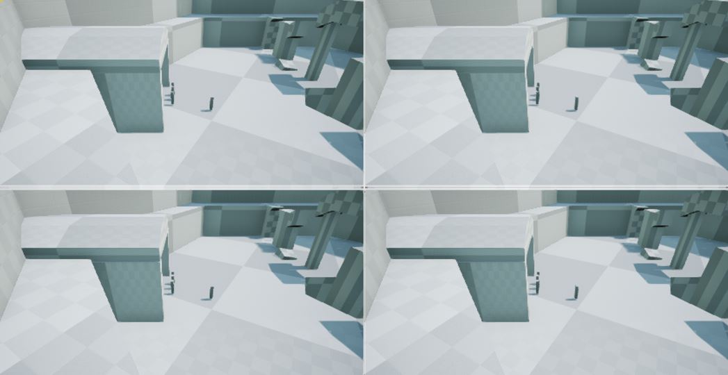
^ (the little boxes represent the players) split screens reduce the surroundings of the players and we can't really see the boss which will be in the middle of the arena. It's a problem so we will go for just one screen. We also need to work more on the camera angle as the angle shown there is not satisfying and not exactly what we were planning to go for. Also the camera angle we want to go for doesn't fit the split screen method.
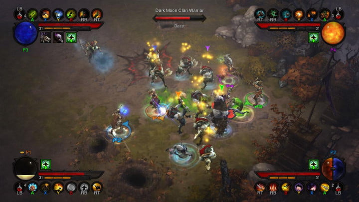
For the camera, we are planning to make it a ¾ top view, in the style of Diablo III or League of Legends. Why this angle? We wanted the players to see more than just a top down view so that they would react better to enemies attacking and moving throughout the level. Since we are going for 3D visuals, we thought it would be nice for the player to see more of the assets in the game. This way we can play a bit with overhang which would fit nicely with the style and theme of the game we’re going for.

^(screenshot from Diablo III) This is the kind of camera angle we would like to go for. Obviously still need to work on it
Why choosing 3D over 2D? 3D allows more freedom of movement: for example it’d be easier to implement a dodging system for the players. It is also an easier way for the player to keep track of their character as you can easily get overlapping in 2D, which could get confusing. It is also easier for the artists, the animators and is, on top of that, less time consuming.
For the environment of the game, we decided we would go for a fight in an arena, against the boss and enemies. Why an arena? First of all because of our theme, which will be explained later on this post. Secondly, it also limits where the players can go. They are forced to stay around the boss and the enemies. They won’t be able to go too far from it which will reduce spreading and confusion.
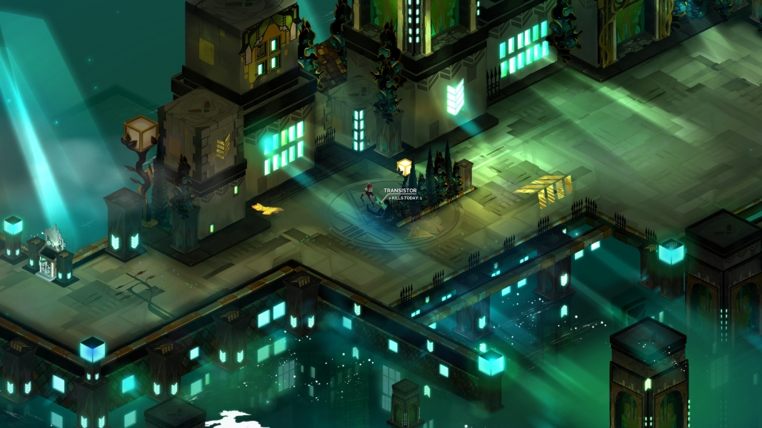
The theme we chose is a bit special as it mixes the Roman arena with a more futuristic/cyberpunk kind of feeling. Why this “weird” theme? We decided to go for a very blocky (but chamfered) style, as seen in the game Transistor. A purely historical theme wouldn’t fit with the style which is why we’re going to mix some more futuristic elements. This also represents a fun challenge for the artists design wise.
Now we also ask ourselves, is Transistor a good style to go for and is it a good idea? We studied the style with the artists by working on our art bible. From afar, the style can look very fancy and complicate but by looking deeper into it, we realised all the environments assets were basic shapes (boxes, cylinder, planes with a texture) with really cool painted textures that can be done fairly quickly. Most of the assets are also re-used quite a lot which will allow us to make the environment fairly quickly (at least we hope).

^ (screenshot from Transistor) If you look carefully, the models for the environment are all very simple. They are basically boxes with cool but "easy" to make textures and emmisive colours.
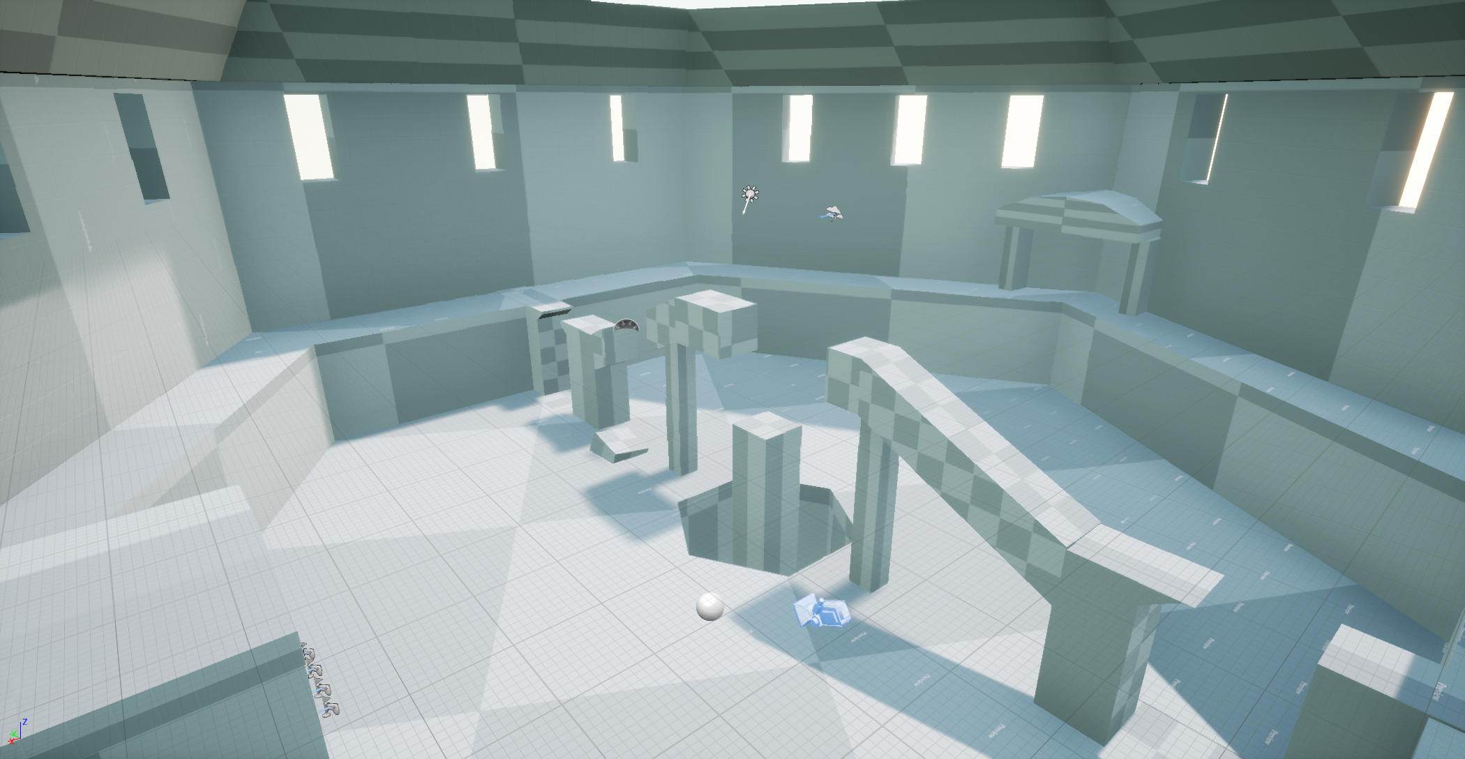
Along with all that, artists started working on the design for the players’ characters and the boss. We also made a simple blockout of the arena to have an overview of how it'd look in game. Here is a screenshot of the blockout:

Our goals for next week:
• Programming wise, we would like to implement the day/night switch and the combats (enemies, spell,…). If we manage to do that, we’ll have most of the core mechanics down and we’ll be able to work on improving them later.
• The artist will continue working on the art bible and finish it. Hopefully, we’ll be able to choose a final design for the players’ characters and the boss, so that we can start modelling in the weeks to come. If we have time (*doubts*) maybe test making a simple asset.
Get [Group4]Gods & Gladiators
[Group4]Gods & Gladiators
Battle a mighty god in a roman/sci-fi looking arena
More posts
- Gods & Gladiator: Finally out!Jun 04, 2018
- Week 12 LogMay 14, 2018
- Week 11 LogMay 07, 2018
- Week 10 LogApr 30, 2018
- Week 9 LogApr 23, 2018
- Week 8 LogApr 16, 2018
- Week 7 Log: End of Production part 1Mar 27, 2018
- Week 6 Log: ProductionMar 19, 2018
- Week 5 logMar 12, 2018
- week 4 logMar 06, 2018
![[Group4]Gods & Gladiators](https://img.itch.zone/aW1nLzEyNzE1NDIucG5n/original/4PO21c.png)